GUEST BLOGGER SERIES

By Joel Lopez
When it comes to creating and designing a product, we are looking for the best solution to ensure we meet our goal. Ultimately, our goal will always be to convince the customer to buy our product or use our service; i.e., for converting leads into sales. But what can we do to ensure the highest conversion rate (i.e., of leads to sales) possible? When we look around for ways to understand what works with conversion and what doesn’t, we may encounter several fads or trends that presumptuously claim to know exactly what we need to do; things like changing a button to a particular color, using a particular picture or icon, or employing a certain layout. However, there is no one size fits all “magic bullet” to conversion. EVERY demographic is different, so we need to use our data and our knowledge of our specific targeted audience to create designs that convert. IF there is one single piece of advice that’s most important, it’s to focus on usability.

Stop following trends to achieve your conversion rates.
Building your product and setting it loose.
You or your client have just launched your new website or product, but you are noticing that your conversion rate is dramatically low. To use an example for this exercise, let’s give a percentage: 0.3%. That’s only 3 out of every 1000 leads converting into customers. Presumably not what you’re looking for.
Concerned, you run off to Google and search ways to convert users and you find articles that say:
“Red converts better than green!” “Orange beats any color!” “Cat pictures! Everybody loves kittens!” “Pictures of people convert better!” “Pictures of products convert better!” “Company logos make you $$”
While each of these approaches may have in fact been useful in one or more scenarios, the likelihood that these “magic answers” are right for you is often slim at best. There’s no data behind the claim that making the button orange in all of our products will help our product convert better.
Another thing to point out when we read articles like the ones above is the quality of leads that the company is receiving. Although we would want as many leads as possible, we would also want to make sure that these are quality leads to getting better data and keep improving our product for that target audience. Having a ton of leads might sound exciting, but we end up wasting our time on leads that don’t go anywhere, in which case we are wasting money and losing opportunities on the leads that will move our company forward and help out product grow.
How do you identify your quality leads?
There are a couple of things to think about before you start the process of optimizing your site for conversion. Here’s a list that you should consider before you start optimizing your site:
-
Know Your Audience – What is your audience like? Their demographics? Their location? Is your website tailored to them?
-
Know Your Goals – What is the ultimate goal for the site? Are you looking to store emails? Get people to sign up for a service? Buy a product?
-
Know Your Usability Scores – How is your site performing in mobile? IS it responsive? How’s the speed of the site when it loads in the browser? How’s the navigation?
-
Check Your Content – Is your content easy to read? Is the language geared to the personality and education level of your targeted audience? Does the content clearly communicate your message/goal?
-
Check Your Fallout – Where are you losing your audience? What is your bounce rate? What is the average time visitors are spending on your pages? What are the high performing pages? What are the low performing pages?
Once you have all of these questions answered, you can start optimizing your site. You will notice that I didn’t touch on your colors or designs for the checklist. Although it was not mentioned, once you define your audience, analyze your website, and have clear goals, you will find that your design will either reflect or miss that.
Find your audience.
The most important thing is your audience. To find your audience you have to look at the process before you started working on the site.

Find your audience.
Who are you targeting?
It is important that you have a precise definition of who are you targeting. If your product is intended for people around the age of 18 – 24, your content, design, and usability should reflect that. The easiest way to come up with all these descriptions is to create your own personas. Personas are fictitious or real people that describe a specific member of your audience. You need to write up everything that you need from them, like name, age, ethnicity, occupation, technology savviness, etc.
You can use tools like Google Analytics or other paid analytic tools to help obtain good in-depth information about your users. You can also perform some user testing in various websites like UserTesting.com or in person where you can develop your personas from them.
What are you targeting them for?
Another clear thing you need to have before you even start the design is the purpose of the site. Are you selling the user goods or are you providing a service? Hows does the site align with the company’s mission and vision? How does the goal align with your personas?
Defining usability data.
Once you have all this data written down, you can then proceed to check your usability stats. When it comes to mobile websites, there is a great tool I like to use to check my user experience (you’ve probably heard of it too): Google PageSpeed.
As a rule of thumb, you want your User Experience grade to be above 90. This means that things are clear and easy to tap/click, see, and navigate through your site. You also want to make sure your site speed is at least 80 or more. If you are 70, check the options to help you optimize your page for speed. Use services like CloudFlare, Highwinds, Akamai, etc. for caching and CDN (Content Delivery Network) to help improve speed.
For your desktop, I would suggest you use tools like Crazy Egg, Google Analytics, Visual Web Optimizer, or any other heat map or visual guide software. These will help you find where people are focusing the most and identify pitfalls such as areas that don’t get much attention. If you combine some of these products, using heat maps, trackers, and Google Analytics you can identify your fallouts and what pages aren’t performing the way you want them to.
Another great way to test your product is by performing live user testing either at your site or at a formal user testing facility. UserTesting.com is a great tool that you can use to test your websites or mobile applications. You set up your questionnaire and identify your audience, and just wait for the results. Listen to their feedback, but watch what they do. Sometimes an action gives much more data than an answer to a question.
The next step on our list will be to check the content. This could be an incredible source of valuable information. Sometimes we focus on the design, when in reality changing a few words here and there will give you the conversion that you desire. Check your content before you decide to make any other design changes.
Everything checks out, then what is going on?
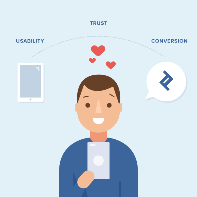
When you look at the design and start wondering what to change, keep in mind that you want to test for usability and not for conversion. I’ll explain this in a bit. One of the keys to a site that converts well is that the user trusts it. Repeat that again: One of the keys to a site that converts well is that the user trusts it.
Your presentation, colors, branding, content, everything creates an impact on the user and, in just a matter of seconds, you can lose a user or gain their full confidence.

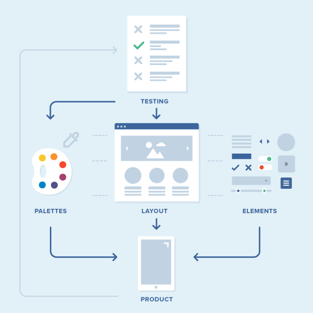
Your product colors
For colors, make sure they are all consistent with your brand and your company. Design for what you want the user to perceive when they first look at the site. Remember, you only have a few seconds before they go away. My general recommendation is that you create a 3 color palette.
-
Your primary color. This color is what most of the site will have. The color will portray your company/product’s vision.
-
Your secondary color. This color consists of the items you will use to bring attention to another section of the site while the user reads and digests your content. These would be the colors for your links, navigation, etc.
-
Your call-to-action color. This color is extremely important. The color of this button or link will let the user know that this button is performing an action (in our case, convert them). Normally this color should compliment the rest of the colors. You want this color to stand out, but not clash or take away from your brand.
To give you an example of a fad, there are sites that have claimed in the past that turning a button from green to red, or vice versa, will automatically increase your conversion rate. They will cite an example of how it worked for their site. Before you rush to change your colors, though, look at the design. Is your primary or secondary color red? If that is the case, then your button as red will just blend in with the rest of your product, people will ignore it. Are your colors clashing with red? That creates a distraction, not a conversion.
Layouts
Layouts are going to be important for you to convert your users and these need to be very specific in terms of usability. You need to create harmony between your content strategy and the design emotion you want to evoke from the user when they see the landing page. Remember what we talked about before? Trust. Make sure your page engenders trust in the user.
A lot of people ask about hero banners and how effective they are in terms of improving conversion rates. The answer to this, like most things we’ve discussed, depends on your audience. Does your hero banner easily explain what the user wants? Then go for it. Test it out. Otherwise, consider other options that might fit better with your message.
Another example of a fad is hero carousels. You will notice that some websites will provide a big banner on their page, but just as you are reading it, the banner switches over and shows you more information. This rarely works well for usability. You are creating a stressful situation for the user, because now they have a time limit to finish reading what they first saw upon arrival. If you want to use carousels, make sure you make them with plenty of time for a user to finish reading the content of each slides, or just don’t auto-animate it.
Building forms
If you need the user to sign up for something, make that process obvious, easy, and readily accessible.
-
Do you really need all the fields you have on your sign up form?
-
Could more information be collected once you start building a relationship with your user rather than requiring it of them upfront?
If you need a lot of fields for your product form, consider splitting the form into different steps. Make the user follow your flow. Create a funnel that is enjoyable for the user.
Be clear on why you are asking for information. Do you need an address? Tell the user why you need it. You need a user to provide a phone number? Tell the user why. If you don’t need that information right away and you can build a relationship with an email, then go that route. It may take a little longer for you to “secure” that lead, but in the end, it will provide so much more quality to your brand and your business, and will probably yield more leads.
Elements inside your pages
Work with your content team (if you are not writing the content yourself) to discover things that you want to emphasize to the user to communicate that you are looking out for their best interest.
Typography plays an important role. Make sure that your main headline is the easiest to read and answers quickly the question that the user has when landing on your page. Use bullet points to engage the user with simple and quick answers. Give the user what they want, but entice them; educate them on why they need to know more. Once you build that trust and interest, your leads will start converting at a higher rate.
While no single image is magical, using imagery to complement your message is a valuable technique. Are you trying to offer a service that is good for the family? Look for images that complement this, like a happy family. Imagery can play a big role depending on your audience so, again, it is very important that you know your audience before you choose an image.
NOTE: A quick note about using stock photography, it should be common sense by now, but just in case, make sure you’re using stock photography that looks natural. You want the photo to enhance the story of your page, not just display people looking eerily happy while they look at the camera.
YET another example of a fad is showing a professional looking person as a “customer rep” which, 9 out of 10 times, is just a stock image to give a user a sense of trust. Users will be able to identify that these aren’t really the people taking care of them. Additionally, the product should be about your user, not you. How is the image going to make them feel? How does the image relate to the product you’re selling or the service you are providing?
Don’t have imagery? An illustration can help provide more information and instill confidence in your user. Again, when designing an illustration focus on what user needs, the emotion they should feel upon looking at the illustration, and so on.

Usability instead of conversion
So how do you measure the success of your new designs? The main thing that you have to understand about conversion is that it can’t be completely broken down into categories. You have to test and test often. However, when you test, be specific on what you are trying to test. The more specific you can make your test, the better data you will collect to keep improving.
So why should you test for usability rather than conversion? Because when you test for usability you are by definition looking at things from the user’s perspective. The user will notice this and, if you can reach a level of trust between the user and your brand, you will be able to get a conversion. The keyword here for you is trust. If you build only to try and “trick” the user into converting, you will end up damaging a relationship with that user, which will cause you to lose the confidence and trust from that user and many others.
Build trust and build relationships. This can’t be emphasized enough. When you build trust with your users, you keep them coming back and you help promote your business indirectly by word of mouth. People are very active in social media and other areas of their lives. Getting positive reviews will help you get more confidence with new users and better leads.
What is another great thing about usability? SEO. In order to start gaining more leads, you need to drive more people to your website. Usability will not only create a great user experience but it can help you stand out from your competitors on Google Searches, etc. Google has put a huge focus on giving the user what they need, just by searching, so sites that demonstrate the capability to provide the users with that information get ahead from others who are just trying to beat or game the system.
Let’s recap. Evaluate your site and follow the checklist provided above. Test for usability and test often. Focus your design on helping the users reach their goals. Design to build trust, not to trick. The more trust you can build with the user, the stronger the relationship and the higher quality conversion you will receive.
Happy converting! 😀
About the Author
Joel is a product designer currently located in Dallas, TX. Joel has over 10 years of experience in UX/UI design, front-end development, and WordPress development. He has also led various UX research projects helping companies change their designs and products based on the users’ needs.


